"I have never been able to call myself an artist."

|
|
March 22, 2013
- third anniversary Our late, beloved Sandy Chandler Shelton (“Chan”) has left us a body of artwork that continues to amaze and inspire us. It’s hard to believe, but she once was unsure of her talents and struggled to improve her work. Being largely self-taught, she on occasion asked advice from fandom artists she admired. One of these artists, well-known and much admired in fandom, became a confidant and advisor to her. They engaged in a lively correspondence, much of which was saved by Chan. As we celebrate Chan’s life on this third anniversary of the day she was taken from us, we present excerpts from this correspondence. These letters are testimony to several facts – that fandom can inspire you to creativity you may not have realized was locked inside of you, and that when fans “share the light” with each other, beautiful things can happen. Our thanks to the ChanProxy group for allowing the posting of Chan’s correspondence, that you'll find scrolling down in this same page. Please do not re-post any of this material. We miss you, Chan. But your example and your work continue to give us joy and remind us of the power of dreams.
|
|

{Use your "back" button to return to this page after having clicked the links to the images}
|
June 17, 1992 Dear Sandy, Here is the picture you wanted of [me], proud owner of a Sandy Shelton original. (Now, if you could just get one of Koslow holding up his picture!*) I want you to know that, in all my years of being an affiliated “fan,” this is only the second piece of fan art I have ever bought. There is so much more to this business than simply getting a good likeness, a well-balanced composition, and some semblance of technique. To be able to infuse a picture with feeling requires something extra – and you have that. I will watch your art career with great interest. If I can ever be of any help to you please don’t hesitate to ask; I’ve picked up a good many tricks and formulas over the years and just love to share them with others. So…keep up the great work and I hope to run into you again in 1993 (Texas, right?). One quick word of advice, if I may – don’t accept too many fanzine commissions. I learned, the hard way, that these can burn an artist out quickly. “Beast” always
*Note: Ron Koslow attended the Tunnelcon II convention and asked if he could buy one particular piece of art – one done by Chan. He was presented with the piece at the convention. For a more detailed account of this, see Chan’s convention journal here
|
|
|
|
June 23, 1992 Thank you so much! I just received the photo and note yesterday…you are so prompt! It has taken me this long to “sort of” get back into the swing here. How do you adjust quick enough to get a note out? I would love to have a photo of Koslow with my painting…wouldn’t that be a treasure? Thanks for the offer of help. If only I knew the questions to ask. I have had no real training…everything I do is a learning experience. If you see anything that I need to work on I promise to listen with an open mind and give it a try. For me the fun has been the exchange of art for zines. I couldn’t afford my acquired zine “habit” so bartering has come in handy and certainly has helped my drawing. At times I actually found myself fidgeting because I didn’t have any assignments. Thanks for the encouragement and the honor.
|
|
July 7, 1992 Dear Sandy, I get a huge kick out of corresponding with other artists because we have so much in common. Alas, the only other artist who writes to me is [someone who] taps me for pointers on Catherine from time to time. How do I adjust so quickly? I hadn’t given it much thought but I guess I do. Conventions are old hat to me; I started going to major East Coast Trek cons [a long time ago]. It’s fun to be back in that kind of circuit again, and I have it down to a science. I always take one extra day of vacation time after a con to unwind and catch up on all the dirty laundry. I love your sketch of Vincent on the bridge. God, you can even do perspective! Even Vincent is in perspective. I admire the way you achieve the rock-effect and the wood-effect and the ratty-rope-effect. I’m already thinking back through [some of my work] and wondering whether I’m up to your standards on any number of things…. But that’s the fun of admiring some other artist; I like the feeling of “Uh-oh, I’d better shape up in (this or that).…” Keeps me on my toes. I know what you mean about not knowing how much to put into something. It’s hard to predict the fan “market.” I just tend to believe that if I draw what feels good to me it will probably feel good to others. To get really technical – those fine-point rolling-ball pens are really good for hair, which needs to be done in fast, flowing strokes (not my greatest asset, I’m afraid). But they’re too fast for details like facial features, which I find need much more deliberation. Have you stumbled across the “fast face”/”slow face” phenomenon yet? This is something I found out when I was doing so much Star Trek portraiture, years ago. I gradually discovered that Kirk looked best when done in rapid, sure strokes of the pen, whereas Spock’s face could be done slowly, with any amount of deliberation. Since then, I’ve honed this principle down to the fact that heavyset, fleshy faces apparently need to be drawn in fast strokes in order not to inherit an even heavier “feel” due to labored or uncertain lines. William, for instance, needs to be sketched very swiftly. Catherine, too, is a “fast” face. Vincent, on the other hand, doesn’t seem to need those speedy strokes (except maybe in the hair). Neither does Father. Guess I should wrap this up. Have to get ready to entertain the in-laws tomorrow evening. (Don’t you hate trying to explain your B&B activities to the great uncalled? I usually just shrug and use Catherine’s line from Happy Life: “It’s complicated…”). Keep up the great work. “Beast” always –
|
|
|
|
July 18, 1992 I don’t know where to start. I had six letters come on the day yours came. Each one lifted my day…but I started with yours. I am so pleased that you like to correspond with other artists…hope you can find one. That’s a joke…. You see, I have never been able to call myself an artist. I have always said I am a “doodler.” Are we all insecure about this or is it just me? I still have this fear that someone will look at my stuff and say, “Too bad. She almost had it once, but she lost it.” I went to a Media-West convention in Lansing in May just to get used to having people look at my pictures. (I had “not for sale” on everything.) Other than that, I have only been to the last two B&B conventions…Tunnelcon[II] was my first for showing and selling. I [think] your stuff is great. I don’t think I will ever get tired of [it]. ([Yours] is one of the few zines I have read more than once…and I have read well over 100 this past year.) I look at the way you draw Vincent’s mouth in that cute silly smile and I crack up every time. I can barely manage to get his mouth open a little. Do you go immediately into ink or do you pencil first? I pencil the position in roughly and then go to ink. I prefer pencil or even watercolor to ink because they are easier to work over, but the editors I have drawn for have been most pleased that I can do the ink because they are so easy to reproduce. I like to shade, but it’s hard to do with ink. I don’t have the patience to do stippling. Someone told me once that I have to put more time and care into my pictures. That would be the same as going back to proofread my letters…I should do it but I don’t. (They would never get finished, let alone mailed.) You asked if I had stumbled over the “fast face”/”slow face” phenomenon yet. I think I am too new at this still. One phenomenon I have stumbled on is the “It’s 11:30 at night, I have only 10 of my 47 report cards started for conferences, there are two kindergarten Halloween parties and my two children’s birthdays to plan, so WHY do I feel like I MUST draw NOW!” phenomenon! Another one is that what I draw for myself is much better than what I am assigned. (But everyone knows that one.) When you are doing your “f.f.”/”s.f.” are you using reference pictures or can you whip them out without a reference now? It bugs me but if I really want a “good” Catherine I have to go to a picture. I have a stylized Catherine but I want to be more consistent. I like to sketch moving bodies…is that different? Maybe that is why I like scratchy lines…I just keep scribbling until I have a line I like and go over others or erase. I have always sketched my teachers, speakers (and preachers in church)…and I like to sketch while I’m watching episodes. Well, I have to go do a little more housewife “stuff.” I quit housekeeping a year ago to give drawing a shot to see if I could do it. I told my husband I wanted to do it but I couldn’t teach, be “MOM,” wife, cook, housekeeper, etc., AND draw…. He agreed to it. Now that the year is up I have quite a backlog of cleaning and repairing.
|
|
July 27, 1992 Believe me, you’re far from a doodler. I can feel myself getting grey hairs when reading that line of yours beginning: “It’s 11:30 at night….” With so many demands on your time, it’s more amazing to me than ever that you’ve produced so much and developed your talent so far. Actually, we do have a handful of genuine artists in this fandom. Gipson has some truly shining moments. I also admire Farver and Terrell. [...] They do what they do very well, I think. I don’t use pencil first, not anymore. I find that a rough sketch tends to bleed off important energy. So I usually start out with my felt tips, though sometimes I will indicate a line or two in non-photo blue pencil – usually after I’ve got started in the felt tip! Anyway, since I’m not worried about creating beautiful originals (you’ll notice I never have anything hanging in the art shows!) I just glob them up with liquid paper, and when that gets too much to draw over I start cutting and pasting. Yes, I work from photo refs, always. But frequently I work from more than one for the same picture! I [may] use only the shadowing from Catherine’s face [from one photo reference] and use another photo ref for the details of the profile. I often find that I really like the pose or the lighting in one photo, but can’t get enough detail from the face – or something like that – and so I will search for another photo showing almost exactly the same facial pose, and incorporate that one into the sketch I’m making from the first photo. Don’t feel annoyed that you can only get a good Catherine when you work from a photo. This makes perfect sense. Remember, all those old-time great artists we were taught to revere in grade school worked from live models, and both they and the models were paid by their “sponsors” to put in the necessary time. What you need to do is take dozens of shots from your TV screen, from your taped episodes. Yes, shading is hard to do in ink, especially large areas. I’ve been using dot screen quite a bit in my graphic work – but “comic” artists frequently do use dot screen, so it doesn’t look really out of place. I don’t know how it would work out for conventional fanzine illustrations though. Love your “hunk” study of Vincent with flowing hair…. Your use of open shape is especially good in this piece. Actually, I find Vincent harder to draw than Catherine. I can’t decide whether I hate his chin/lower lip area or his cheekbone/zygomatic arch area the most! Send me stuff anytime! I just love to troubleshoot. I will probably ask the same of you at some point (but don’t hesitate to “volunteer”; fresh eyes can often spot things I can’t!) “Beast” always –
|
|
|
|
August 16, 1992 Gipson: I love her style…and I’m thrilled that she has as much trouble with Catherine as I do. (In fact, it was seeing that [panel] at “South of Oz” that gave me the feeling that I could do this stuff too. If they could be that good and still mess up and lose it here and there…then why did mine have to be perfect? It was quite a boost.) Terrell: So Lively, full of motion in her drawings…I like them. (Could be because some people have compared me to her?) I blew about 8 rolls of film trying to get shots from my tapes. I over-exposed them all. I used three different cameras. Anyway…I went to the Detroit [fan club] meeting and spent the night with Barbara Hill and she showed me how she does it…and sent the prints later. They were great. (She didn’t turn the lights off in the room.) It’s a good thing she likes to trade because I don’t know if I have the patience to keep trying. (And it’s a good excuse to spend the night…I get the VINCENT ROOM with all the prints and zines.) I don’t retrace my pictures. I usually scrap them if they’re not coming out right. If it causes problems for me then I lose interest in it and prefer to come at it from another angle. That’s for non-photo drawings. If I’m using a photo and it isn’t working then I leave it and come back later IF it hits me. I have several drawings that are just four or five lines on a page. I may go back to one later…maybe never. I don’t understand why I do things the way I do. Sometimes I confuse me. I’m glad I don’t have to make a living with my drawings. My husband tells me he would like to see me do more…but I don’t see what he sees. I look at it as my outlet. I was hurting pretty bad when the show went off. I was very surprised that I was so wrapped up in it. I thought it would pass, but it doesn’t seem to. (Although the fun of drawing “the happy life” has put the painful part into the background, the interest is still intense.)
|
|
September 16, 1992 Dear Sandy, I’m so glad you heard from Koslow. Thanks for sending the copy*; it was most interesting. I’m still just so thrilled for you. I taped Roy Dotrice’s new show “Going to Extremes” last night and plan to watch after work today. I’m so happy he’s in another TV show, because maybe at long last I can get some decent photos. In B&B he’s always down in the tunnels and the lighting is just so darned murky that the shots never come out with much detail. I’m always interested to hear about how you work. Honestly, the gyrations we sometimes go through! Write when you can. Hope the academic year goes well. “Beast” always –
*To see the note and read its contents, go here and scroll down, it's in the bottom.
|
|
|
|
September 22, 1992 Thanks for the letter. It came at a good time. I have been working all summer on the other Sandy Shelton’s book with only a few drawings going anywhere else. My husband asked if I was getting tired of drawing. I’m not…I’m just tired of drawing so many just for one. I want to hurry up and submit some so I can get more zines. I don’t have a good copier, but I do have a few extra of the pictures I have been working on. |
|
September 30, 1992 Dear Sandy, The artwork is fabulous! Thanks for sending such a dazzling array of pieces. I love your “upside down approach.” Can definitely be ranked as a second style; it’s every bit as good and possibly even more effective in some ways than your regular one. The soft focus effect is great, and doesn’t diminish the likenesses one bit. I hope you plan to do more with this style! Anyway, my two favorites of the batch of “regular” stuff are the close-up of V & C crying in each other’s arms – very dramatic and strong in every way – and the lovely sketch of V writing at his table. Really, really nice stuff. The one of C hugging Joe (?) is a winner too. You did a good job with the guy’s hair from the back, not an easy task. I don’t like the other one as much; the pose suggests that Vincent is lecturing Catherine rather sternly about something! Also, his hand position seems odd in relation to where Catherine’s face is. (Is it supposed to be resting against her face?) Because of the fact that the hand is turned outward from her, the feeling of intimacy is jeopardized (always think about body language!). If I had done this scene, I’d simply slice out that vertical hand and give the scene back its feeling of intimacy and affection (not something you can do if you’re planning to sell these as displayable originals in an art show, of course. Then again, if this is in pencil maybe you can just erase…). The tumble on the couch [image unavailable] is good; strong Catherine likeness and the way Vincent’s hand is pulling back her hair is a clever touch suggesting passion and haste. Can you improve on V’s ear a little? Probably any magazine clipping of some guy’s ear would do for a ref. I know ears aren’t interesting, but I hate to see such a good artist fall into the trap of overlooking the less interesting parts of anatomy. You’re strong on hands, so why go limp on ears, eh??? Come on, Shelton!!! It’s only a little ear!!! Very, very, very good hunk pose, though. Actually, you’ve sent me this one before. The body is so good—drawn just enough. Have I said before that a lot of talent lies in knowing when to stop? You have this instinct; good for you! Many a fan artist would have sketched in every chest hair, spoiling the effect with too much detail. In the one of crying Catherine hugging a small child, can you soften/downplay the kid’s eyelashes a little? The eyelashes of young children don’t tend to show up as such heavy individual lines. Wonderful Catherine likeness in this drawing, by the way. Thanks for sending these -- some of them are now taped to my office wall! Keep up the great work, Sandy! Oh, did the Other Shelton write a good story to go with all this wonderful art??? “Beast” always –
|
|
|
|
October 9, 1992 Yes, Sandy wrote a good story. Some of the drawings didn’t reproduce very well. They don’t have a big budget, but I like them. I do like to read the stories I [illustrate] whenever I can. I hate missing details in pictures. I don’t like illustrating for the whole book because then I have read it all before I get it. Kind of takes the fun out of getting the zine.
|
|
November 11, 1992 Dear Sandy, Thanks for sending more artwork. Your squinting Catherine study is quite nice – good solid likeness, but you and I seem to be having the same problem these days with getting her face a little too broad. The mouth is really good, nice use of open shape. I tend to “correct” her face and I keep kicking myself because of it. The facial furrowing is very well done. That’s one of your strong points, I’ve noticed. I have trouble getting furrows to look natural, and not like the person has a bunch of licorice whips stuck to his/her face…. Thanks for keeping me updated on your art; I’m really enjoying that. I’m amazed at how productive you can be, leading such a hectic life. WHERE do you get your energy???????????? “Beast” always –
|
|
|
|
December 27, 1992 I found someone to scan my pencil drawings. I’ll send copies of what I had scanned. I got back the pictures I had done for Sandy’s book [Love Has Not Forgotten you - you can see all of Chan's illustrations here ] and have gone over the child’s picture. You were right of course, the eyelashes were much too exaggerated. I went back over a lot of the pictures to change things that bothered me. It helps to have not looked at them for a while. I did three more “Catherine” pictures…working on the raised eyebrow. I’m getting better at photo reference pictures…but now I feel less able to do “off the cuff” pictures. I have started a collection of photo references…and Barb Hill will do just about any shot for me in exchange for prints of my drawings. Usually when I go down to Detroit for meetings I spend the night with her going over the shots she has or going through episodes looking for what angles I want. I love this barter system. |
|
January 21, 1993 Dear Sandy, What fun to find your fat package in my PO box this morning. I’m sorry to hear that working from photos depletes your ability to sketch spontaneously. Your spontaneous sketches are so nice; I’d hate to think of your losing that ability. Nonetheless, I suspect that one can learn a face a lot quicker by working from photos. But that’s only my opinion, of course. “Beast” always, [It included a sheet of xeroxed art with pen-written comments] 1) WOW – this is FABULOUS; Best V-face you’ve ever done. You could probably sell hundreds of these. <arrows pointing to the right side of the image> Use of “open space” Yes! Yes! Yes! 2) Great Catherine. I think her forehead’s a bit shallow but it really doesn’t matter because likeness is so strong. Wonderful hair! 3) Nice baby - Vincent’s nose too broad. 4) Great Catherine – V’s eye needs a highlight.
[undated postcard – postal stamp is February 11, 1993] Dear Sandy, Thanks for sending the article – I really enjoyed it. I love the way you drew Vincent’s jeans on the sexy pose [the Vincent-leaning-against-wall image on the upper left] on your latest card. While I have a feeling RP’s thighs would never permit a wrinkle or fold anywhere, I still see this rendition as totally valid! In other words, it works!
|
|
|
|
Feb. 17, 1993 I’m glad you liked the article. I don’t think I said many of the things that had quotation marks around them…but all in all it was a favorable article. Actually I think I liked her quotes better than mine. She made me sound intelligent and fluent rather than disjointed and unorganized. One of the things I lived in fear of before the article came out was the kind of interpretation the writer would put on my fanaticism. Imagine the buzz that could have occurred if they had portrayed me as the fruitcake they could have seen me as. (“This person with this strange obsession is teaching OUR children?!”) I’ve had a lot of good comments from friends, colleagues and parents. (How come you and Rosie [Hauer] and [Lynette] Combs and so many of the other artists can write as well as draw? Did I miss a handout line somewhere?) That hunk picture on the card: I know RP’s jeans wouldn’t crease that way…but I figure if everybody else can re-arrange his body shape then so can I…(and the baggy pants worked for me, too…as long as I can throw in the bare arms.) Somebody said they couldn’t see Vincent dressed that way…but maybe if Catherine had succeeded in convincing him he was worth looking at he would have dressed that way for a hard job of lifting and digging around in tunnel muck. I can see it…it works for ME. (Yes, yes, yes….) Sorry about these run-on sentences. I tend to write like I think. I already beat you on the comment for the Vincent with baby picture. I started back to work on it. Actually I was most uncomfortable with the eyes. They were much too large. Then I worked on the hair…THEN on the nose (yes, too broad). I’m happier with it now…but in six months I’ll see something else wrong. Catherine picture: Yes, shallow forehead…but I’m not ready to touch it yet. I don’t “see” what needs to be done yet, and it is close. (The nose might be a tad too broad also.) The “open space” one of Vincent that you liked…I like it too. I colored the eyes blue on one of my copies. Now he stares at me properly.
|
|
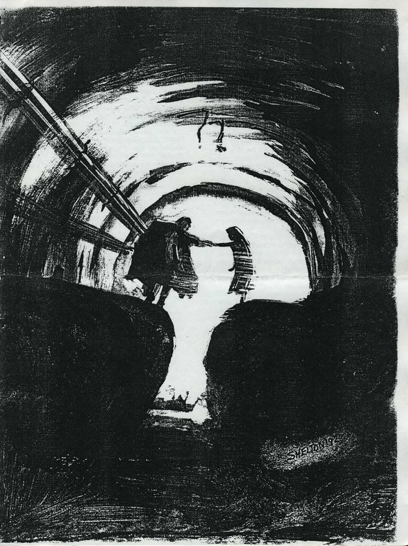
Feb. 28, 1993 Dear Sandy, The reason why I can write (I can’t speak for the other artist/writers you mentioned) is because for most of my life writing was my primary hobby, and the drawing was less important. But nowadays I seem to spend much more time drawing than I do writing! I keep wanting to go back to more intensive writing – but that would mean cutting down on the art. The problem with cutting down on art – as you no doubt already know – is that one tends to lose ground. I hate to let go of the skills I’ve worked so hard to develop over the last few years! I have had some experience of being interviewed – both newspaper and radio. You always feel as though you are going to be seen in a bad light. I can certainly understand your apprehensions, with parental attitudes at stake…. I got into fandom through a tiny clipping from the magazine section of our local paper. It was about the national fanclub, then run by Deb Hense. Thanks for the valentine. My vote goes to the wonderful silhouette of V & C hugging at the tunnel entrance. It is far more BatB in atmosphere than the one of Vincent and the unicorn.
|
|
|
|
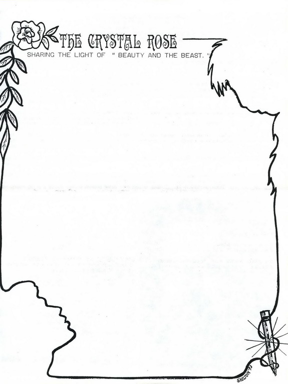
March 3, 1993 This is a quick note…I hope. I am dead tired, but I’m banging my head against the wall over something I can’t see. Maybe in a month I can look at it and see what’s wrong, but not yet. I figure you can take one look at it and point it out to me, right? THE CRYSTAL ROSE asked me to redo their logo. I thought I would give it a whirl. I like what I have, but something is off on “Catherine.” Joann [Grant] thinks it’s the eyes. Sandy [P. Shelton] thinks it’s the jaw. I like it well enough that I don’t want to goof around with it. I’m sending you [a copy] to pick at if you would like to. * This link is to the final version of the logo, after Chan made numerous changes per her correspondent's advice and her own tweaking. Unfortunately, the earlier version which they discuss in these letters is not available for a “before and after” comparison. |
|
March 9, 1993 Dear Sandy, It was a special treat to get something from you today – I need a lift. Your new logo page for CR is lovely. Since my opinion has been asked for, I have two suggestions. My strongest is that you simply leave it entirely alone. My lesser suggestion is that you do Catherine’s profile over from scratch. Reasons to take my first, “strongest” suggestion: It’s a very good Catherine likeness and the whole thing does “work.” Yes, she has some flaws, but they require study to identify. You aren’t going to get that kind of study from your major audience, only possibly from artists. Again, the picture works – very well – despite these flaws. Reasons to take my second suggestion: I really don’t need to state them – they’re all inside you. I’m sure you’re just like me in wanting to fix and fix and fix until something is as “perfect” as it can be. Yes, Catherine needs some work here. But minor fixes aren’t going to do it all. It’s a structural, placement problem that’s been bugging you, and to fix that you will have to start over. By now you are probably foaming at the mouth to start reading the enclosure and find out what needs to be done. Keep up the great work – From enclosure to this letter:
1) Lower the ear.
|
|
|
|
March 15, 1993 I did some pictures last Thursday you won’t believe…well, maybe YOU would, but I don’t. The only problem is that they are in color…and that means I have to wait until the next B&B meeting in Detroit which isn’t until weekend after next so I can stop at a KINKO’s on the way. (Do I live in a very rural area? YES.) Back to the pictures: I bought stamps and embossing “stuff” to experiment with [at a closing sale at an arts and crafts store] and the guy there talked me into buying these brown pencils to try. I’ve never heard of them, but it seems everybody else has. I show them a picture and they say, “Oh, sepia!” (At times I feel like Mouse with his discoveries.) I used parchment paper for the base color then went to the red-browns for smudging to the darker browns into the grays and blacks of the drawing pencils…and the picture glows on its own. At the framing class I double-matted the picture with an under-mat of red-brown and the second mat a charcoal gray. It’s beautiful. I took it to school and everybody came down to see it. The principal tried to buy it from me. He asked me to consider it when I am ready to let go of it. (And he’s no B&B fan.) I’ve done 4 pictures now using this pencil combination. I can’t stand it! I want to show you! (Where’s my camera when I need it!) I pored over your letter. I knew you could put your finger right on it. I’m working on it. (Thanks for suggestion #1, it made me feel better.) I’ll show you my updates. Sandy [P. Shelton] sent me her copy of the balcony shot that looks like it. Would you believe I had never seen it? I was using my bookmarker for the background because I recognized it as the one that Pam Tuck had used in the first Crystal Rose logo. But I had never seen the one in much the same pose as mine (without the gifts). If I’d had that one it would have saved me a lot of time, huh? After seeing the matting and framing I did the principal said we should look into that type of equipment. He can see school applications in it. See what B&B is doing for me? In my first attempts to “shop local” I had some pictures at the printers for 3 months…then he printed the picture on the cards BACKWARDS.
|
|
March 22, 1993 Dear Sandy, Just to add to your feeling of backwardness (how rotten of me), yes, I too have known about “sepia” pencils for years, though I call them “sanguine pencils.” Some of my best-selling Trek portraiture was done in sanguine pencil on cream-colored paper – a lovely combination. Thanks for sending a finished version of the passionate V & C. I didn’t notice the first time around that his thumb is hooked through her belt loop – what a cute touch. I’d like to put this one up on my wall. Beast always –
|
|
|
April 12, 1993 Dear Sandy, Thanks for sending the color copies of your fabulous art. [My husband] and I give RAVE REVIEWS to your study of Vincent’s hand with Catherine’s pendant. He said, “This is the best kind of fan art – a totally original approach.” Being such a distressingly honest type, I have to confess that the color Vincent study (with finger pointing downward) doesn’t please me quite as much. The color and the lighting are beautifully done, and the lower part of V’s face is really good – but the shape of his right eye is wrong, and this throws off the likeness. I do realize that his makeup tended to change the zygomatic arch area to some degree from show to show. I just ADORE the tunnel scene of them walking away. Beast always –
|
|
|
May 18, 1993 Dear Sandy, You must be very busy with art. Doing any for the con zine? Write if you can –
|
|
|
|
May 24. 1993 Artwork? What’s that? Just kidding…no, I haven’t done much, but of course I have done some (my pressure valve). I did work on the logo for the CRYSTAL ROSE some more. It is about 3 miles thick with white out…and there is no “original” anymore. I was assigned to illustrate a story for the [Great Expectations] conzine. (The “other” Sandy Shelton’s submission! Together again.) I also had 2 other pictures already submitted. (I thought I saw your name on the committee for evaluating the submissions…or was that just for the stories?) They’re really pushing the time line close for the zine. I also received an invitation to start on a submission for TCIII [Tunnelcon III]. (Bet you got a letter too.)
|
|
June 3, 1993 Dear Sandy, Your Catherines continue to improve at a remarkable pace!!! The one of Catherine looking over V’s head is especially striking. Great likeness, great expression, great structural definition in the face. Got two foreign orders today – one from Italy, on stationery designed by you! I did some art for the conzine, too. I’m satisfied with one of them, and unhappy with the other, but there really wasn’t time to start over, so I sent them both. I AGREE that they’re pushing the deadline for the zine. Don’t bother to answer this! We’ll resume correspondence after the con. Love,
|
|
|
[undated card] Dear Sandy, Saw Carol Kyne recently. She had all kinds of glowing things to say about you, so it’s no wonder you got an invitation to work on the TCIII zine. (I haven’t received one!) Looking forward to seeing you and all your work in July.
|
|
|
|
June 13, 1993 The stationery from overseas…was that the blackline string outline of V/C/roses/crystal? Did it have the Crystal Rose heading on it? We gave it out as an anniversary gift. I was curious if it would even be used. Neat. See you SOON! (Big smile)
|
|
June 16, 1993 Dear Sandy, I’m glad you ignored my suggestion not to write until after the con. It’s always such fun to hear from you. The card I got from overseas was one of your Catherine sketches.
|
|
|
July 27, 1993 Dear Sandy, Did you sell lots of prints at the con? I hope so. We did pretty well. It “felt” like a buying crowd. Love,
|
|
|
|
Aug. 10, 1993 I’m a little nervous about writing to you. I hope you aren’t upset about the crack at the panel about placemats. I really haven’t settled into any one paper…I use whatever is at hand. Joann [Grant] likes the pictures I send to her on placemats. She says it’s some of my best work. I’m afraid I’m not a very good example for anyone to follow. I was hoping that there were going to be demonstrations of techniques by the artists there. I learn a lot more by watching. (I really liked your demonstrations at TCII. I hung onto everything you showed us.) [Your husband] was starting to give me some great advice about what not to get wrapped up in…portraiture, I think…and I got distracted (I am 5)…and now I want to know what he meant. I’m sure he is right and it is important that I hear the rest of what he had to say. Could you apologize for me and ask him to expound a little? It takes me at least two runs for me to get a meaning after I slow down and realize that someone had something to say to me. Yes, it was a buying crowd. I didn’t have anything go to auction, but I had six pictures [sell]. There were a lot of people (especially Friday) buying prints. I made enough to pay for my trip and that is all I really wanted. Last year was more than I could take. Even this year I didn’t REALLY get to see that much more of the people I had been looking forward to seeing. But I did get to a couple of panels and I did enjoy meeting the guests in the dealer’s room and at the bar the night before (I even tried signing with Terrylene). How do you feel about tracing? Is that too political a subject? An artist friend of mine just bought a light box and wants me to get one too. She said we had paid our dues by doing our art the hard way and it was time we realized it was acceptable as a technique. A part of me says that is too easy and I need the challenge…so I am at war with myself. I was just thinking that I had better get to work on Sandy Shelton’s pictures. Did I tell you that I made a run over to North Carolina and finally met her? Now I have a face to go with the hours spent on the phone with the voice.
|
|
August 17, 1993 Dear Sandy, Nervous about writing to me-e-e?? WHAT crack about placemats during the discussion? I don’t remember anything I might have construed as offensive. Really though, my feelings are not easily hurt! I was glad you came to the discussion; my only gripe was that you sat so far away as though designating yourself a MERE member of the audience. I’ve told Betty N. [Neiswender, the con chair] that I’ll do a demo again. I’ll try to modify or at least add to my regular talk so my “repeaters” aren’t bored out of their minds. A lot of what I yap about should be used as a refresher from year to year, anyway; I constantly have to remind myself of the basic principles! There really is no way to make fannish selling pay. “Non-profit” isn’t just a disclaimer, it’s a fact of life. We fans have other reasons for our selling that no regular commercial outfit would consider: the importance of sharing our work with our friends, the love of supporting the show at our own expense, the social factor of the conventions, etc. Tracing…now there’s an explosive topic! I’d be curious to know the tone used by your friend. When the subject comes up among amateur artists it’s usually in an accusatory The-Reason-So-and-So-Is-Good-Is-That-She-TRACES!!!! sort of idiom. Don’t buy into it; tracing is highly over-rated as a quick-fix magical shortcut to anything except extremely symmetrical forms. I think I have figured out why. The process we artists must use in drawing a likeness from a photo ref is one of translating light and shadow into lines. Tracing DOES NOT automatically make this possible. The only thing tracing might provide is a short cut to correct proportions, but even then you have to know how to find the “edges” in your photo ref, and most people have no idea of how to do this. And it’s very tricky because, in your average photograph, the edges are NOT where they appear to be. The artist has to know how to translate the shadows, or areas of reflected light, into lines that will correctly define the form. This ability – or the lack of it – is what really separates fandom’s “top” artists from the lesser lights. But a definite YES to the lightbox. It’s such fun to refine rough drafts over a light. Love, [From the correspondent’s husband] August 17, 1993 Dear Sandy, What I was trying to tell you at the con was that I thought that you should try to do more illustration rather than devoting most of your energies to portraiture. When you do portraits, you are placing yourself right in the middle of the pack. Other people can get a likeness as good. Illustration has some message or story content that portraiture usually lacks. “You Can Do It” and “The Quest” are two superb examples of the kind of thing I’m talking about. Both pieces illustrate scenes from the show. Neither one relies on likeness for its power. Both are visually attractive. Just let your imagination run wild and bring the results to TCIII.
|
|
|
10/26/93 Dear Sandy, I’m not doing any art right now. I’m deeply engrossed in a sequel [to a zine]. Don’t recall whether you were an admirer of that piece or not but most of my customers & contacts are thrilled that I (finally) got hit by an attack of Plot for the next installment. It feels good to be writing again. Love,
|
|
|
December 7, 1993 Dear Sandy, Sorry to have been such a reluctant correspondent lately, but I’m still engrossed in sequel-writing. I have quite a complex plot going, with many different things happening at once, and the whole mess just seems to take up all my computer time. I seriously doubt I will sell this zine at any convention. I’m thinking of just making enough copies to satisfy the immediate mailing list with no surplus to sell off later at cons. Thanks for the darling card! As usual, your work is refreshing in originality & charm. You’re really in a class by yourself as an artist. Love,
|
|
|
|
December 18, 1993 It was good to hear from you. I thought I was the one who was not corresponding! The CA convention is being sponsored by the Advocats (but they have a new name which I have forgotten [Note: Carousels and Caverns Community] whose members are Ben Bock, Rose Badgett…I can’t remember the others. They have sent me a couple of complimentary copies of their new newsletter called THE MIRROR POOL. They just regrouped with their new name. I would love to go to CA, and would love to get a sketch pad out to the park entrance and the carousel! I hate to think of not seeing you [at the next con]…you are like one of those foundation stones. (Not meaning OLD…but IMPORTANT.)
|
|
|
[undated letter apparently sent post-con in late July or early August 1994] I have tried to write to you several times. I tried to write after we finished the first calendar, but we ran into calendar deadlines, getting pictures matted and calendars bound, last minute plans made for the convention. After the convention I tried to write with all my exciting news but I had to go back into my classroom to finish up on things I had left undone while I got ready for the convention. At the same time we were having tough luck with the calendar reprints. Kinko’s erased the Adult calendar and I had to get everything back together and get it to Detroit to scan again. Now I can write to you! So, what’s going on in your life? How’s the book coming? Don’t mean to push you, but I could use a good book. You were missed [at the con]. Your name came up a lot. Of course it was the usual crazy whirl and no one really had time to “get together” like we always intend, but it did seem like we saw each other more than in the past and we “felt” closer, I think. I’m already sending in my California reservations. I did pretty well. We sold out of both of the calendars on the first day and I ran out of T-shirts on the second day. I had 11 drawings go to the art auction. One pencil drawing went for $225! (The nuzzling one with Vincent’s thumbs hooked in the belt loops of Catherine’s jeans.) I had the plaque for fanzine illo/Amateur category: 1st place in black and white/ 1st place 3D for an etching on a goblet/2nd place for a T-shirt. I bought a drawing this year. Everyone put such low starting bids that I took a chance and bid on two. I actually bought one of Pam Tuck’s pictures for $20. Go figure. It is beautiful. On the Adult calendar, we sold them all before Pat [Leslie] and I realized we didn’t even save one for ourselves!
|
|
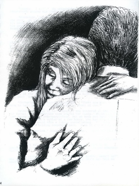
August 15, 1994 Dear delightful Sandy, I love all the art pieces you sent. Your Catherines & Fathers are a thousand percent better – they’re fantastic! You’ve turned into one of the top artists of this fandom, so you can imagine how amazed I was when you mentioned winning various awards in the AMATEUR category of the art show. What in the blazes were you doing in THAT category??? The Sequel does progress, though slowly. It’s easily the most challenging plot I’ve ever come up with and I get “lost” all the time…. If it all hangs together in the end, a miracle will definitely have occurred! I missed seeing you, too, and getting a shot at buying more Shelton originals. But Carol [Kyne?] did send me one of your adorable T-shirts, and that made up for a lot. I’m not surprised that sketch brought over $200!!! It’s a brilliant piece of work. The positioning of Vincent’s head is EXACTLY right and you can feel the “weight” of it on Catherine’s shoulder. Things like that make all the difference in how well a piece works. Love,
|
|
|
|
Aug. 24, 1994 My adorable T-shirt? The official convention one? I [did] a cut & paste routine. Vincent and Catherine went okay, but I blew Father and almost threw it away. I sent it along with another rough sketch anyway at Betty’s insistence and they said that was the one they wanted. I Xeroxed his face out and put the new one in, then drew Elliot and Devin. Next, Devin became Mouse. That picture has been to Las Vegas and back more times than I can count. (But I was pleased that they wanted it.) Amateur/Pro? What makes a person one or the other? I’m not sure anyone knew how to divide it up. That was my big question for Betty when she said there were two divisions. Clare [Seiffert] was easy…it is her career. Barbara [Gipson] is in the “pro” novels. Same for Beth [Blighton]. Barb says I will have to be in the “pro” category next year since I won so much this year. That sounds okay, but do I tell people now that I am a real artist? (Gee, I still feel like a Kindergarten teacher.) It sounds like you are beginning to move away from the B&B fandom…off on new adventures. (Just get that book finished first.) I wonder if I will find another fan-ish interest? Nothing else looks good to me. [My husband] is worried that I might not go on with art after B&B. What drew you back to pencil? I like it because I can move it all around until I’m happy (or just quit). I don’t like to do the same pictures over…which is what I feel I’m doing when I cut & paste with ink. It works, but it isn’t relaxing. I wouldn’t dream of divulging any information on the plot. (I’m not usually in anyone’s inner circle – thanks.) But don’t tell me any more. I never try to guess what is in my Christmas package or the sex of my children…I like surprises. I’ll just sit back and twiddle my thumbs (un)patiently waiting for the book. Gosh, this is a rambling mess. I think I’m tired. I want to keep in touch so I will try to get right back to you so I won’t lose you again. You don’t have to rush.
|
|
October 25, 1994 Dear Sandy, It was very sweet of you to send me the calendars. Sorry I’ve taken so long to respond. This is an unusually busy year and I don’t get the time on the computer the way I used to. The calendars are really lovely. I think I favor the “Chamber Music” one for overall quality and consistency. Passion really seems to be your thing. Your work communicates it better than any other emotion. (And what does this say about our little Sandy? I won’t ask!!!) Anyway, thanks a million for them. I especially appreciate the notes pointing out which ones were winners, got audience response, etc. I love the way you draw Catherine’s hair; nobody does it better. I’m still working on The Sequel – when I can get the time. Yeah…I am moving away from B&tB, though I am still enjoying working on my manuscript. What drew me back to pencil??? I guess the main thing was that I wanted to do a lot of portraiture, as opposed to developing a style that would lean toward illustration. It’s kind of fun to work with [drawing another actor] after the highly nuanced Vincent, where “expression” resides mainly in the eyes and corners of mouth. I enjoy your expressions of appreciation toward my art “guidelines,” wondering why I didn’t go into teaching, etc. I’m willing and even eager to impart what I know to anyone whose interest is of a degree and quality that I can respect. In other words, I need to feel a certain level of respect for the person I’m “helping” before I can be truly willing to “help.” An awful lot of aspiring “artists” expect to be able to accomplish miracles after getting a few tips from somebody else who is pretty good; they are not willing to grapple with the reality of the hard work and huge chunks of time involved. I hear you’re going to be doing some art for Debbie Nockels. She was thrilled to get you. Love, [posting Chan’s calendars is next "Chan" project for BatBland -- stay tuned]
|
|
|
|
November 25, 1994 I can’t believe the stuff you sent to me. I have been digging through it over and over with excitement. You know that stuff is worth a fortune…I feel honored. Are you sure you don’t want to sell it and get a little return for your money? And are you sure you don’t want it anymore? I was glad that you finally wrote back. I was sitting on pins and needles waiting for your reaction to the calendars. They were a lot of work, but I learned a lot. I think next year’s will be a lot easier. I already have 10-15 possible pictures for it. Thanks for the box!!!
|
|
|
|
|
March 22, 2013 |
|